I’d like to introduce you to Charlie Ford, if you don’t already know him. Charlie Ford is one of my favourite artists, we met when Chris and I first moved to Hebden Bridge at his exhibition at Wainsgate Chapel, an artist hub that we volunteer at. I was immediately drawn to Charlie’s precise, contemporary style. He also happens to be an incredibly kind and generous person. Visit his studio site here to see his online gallery, some of his work is for sale.
His partner is Lucy Suggate, a dance artist and choreographer, and some time later they both collaborated on an exploration of stone and time, blending the media of movement with tactile graphite on paper, formed into the shape of rocks. The performance and imagery struck a nerve and has stayed with me.
In time, I mentioned to Charlie how I’d also been thinking about stone a lot. The stone around us in the rugged landscape we live and how that has been informing me of its use in gardens. His visuals and the performance really captured the same feeling.
I tried to explain that I’d been thinking of changing my logo, refreshing the look and removing the term ‘garden design’ from it to better represent what I do and how I feel as a person.
When we were chatting, I explained that my dream garden would simply be a large monolithic stone to sit on, surrounded by wild habitat. Not a garden at all by traditional thinking. It’s that idea that has always been at the heart of what I do but I wasn’t sure how to bring it to life visually for a logo.
To my surprise, Charlie said he’d love to design the logo for me and we set on a collaboration to explore what it could be. I found the process so beautiful and fascinating I wanted to share some of the imagery below.
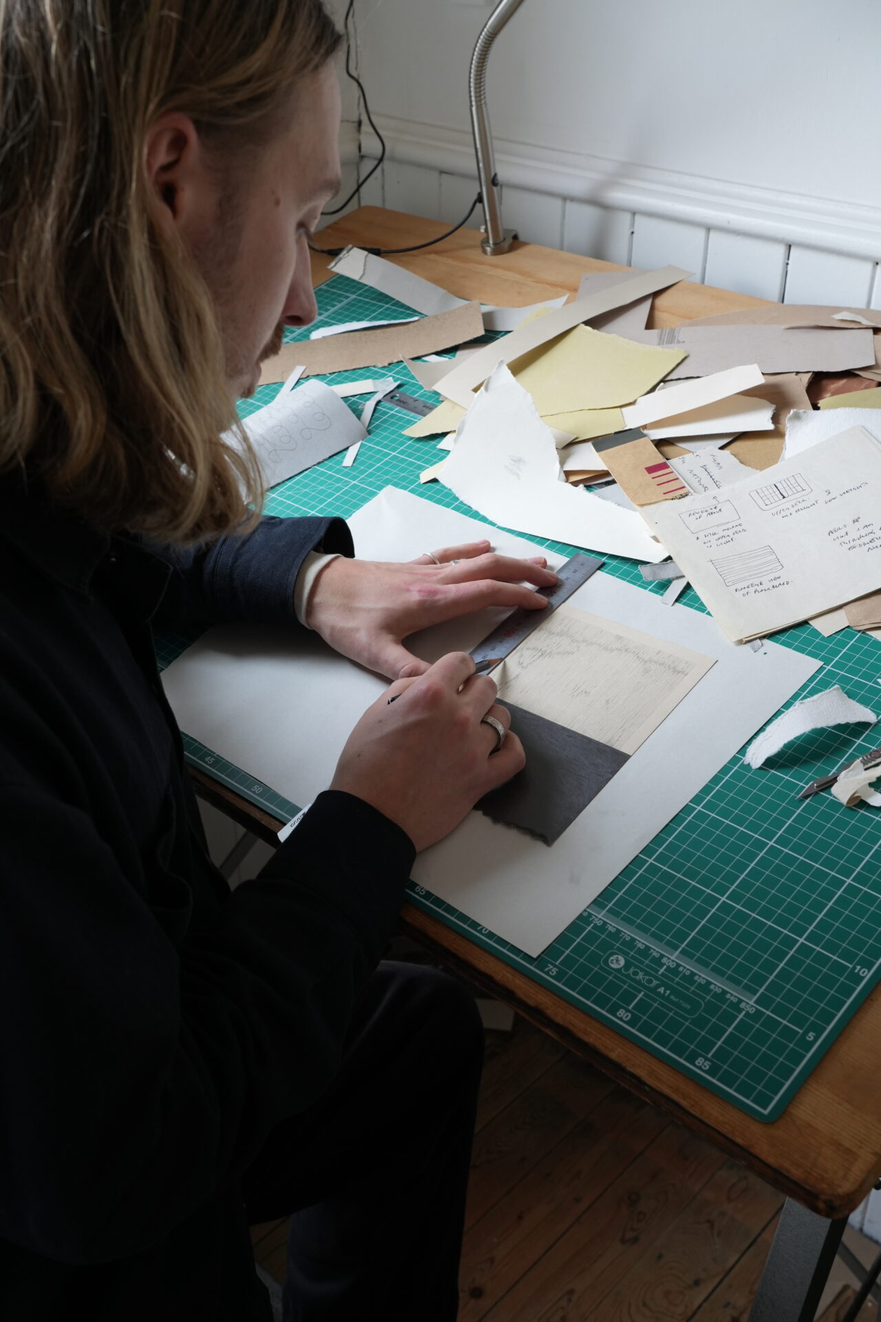
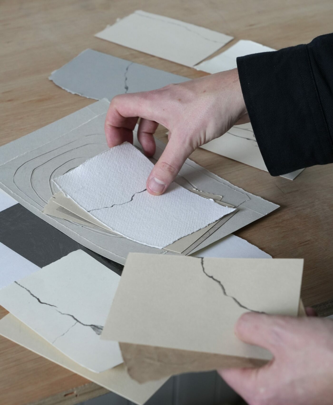
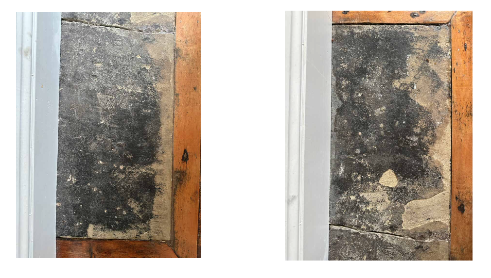
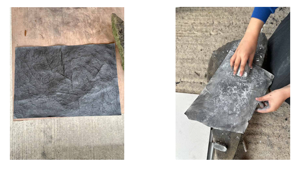
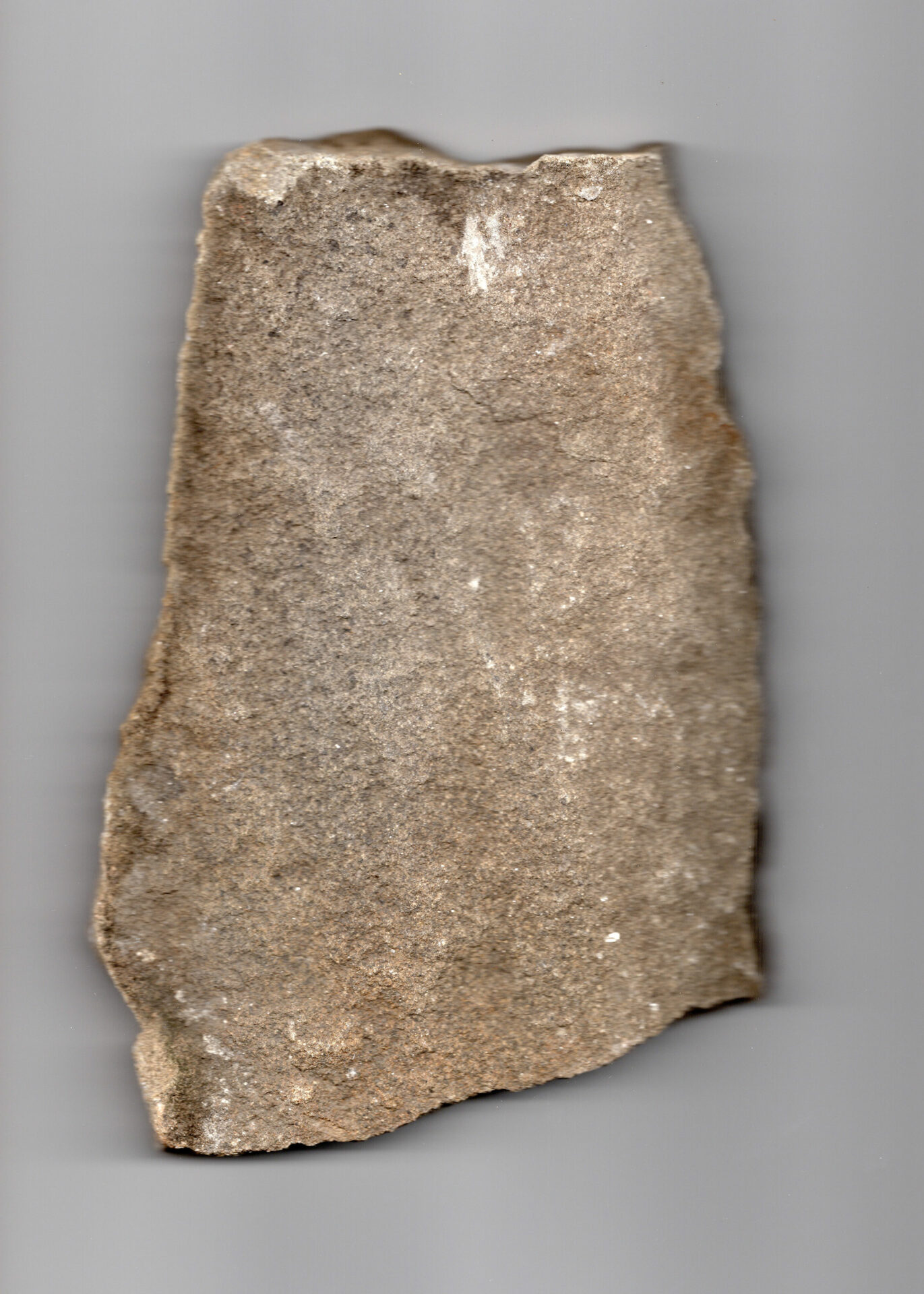
Charlie began working with analogue materials, inspired by the idea of monolithic stone and a cracked hearth in his home. Recreating the look of the natural stone using graphite on paper.
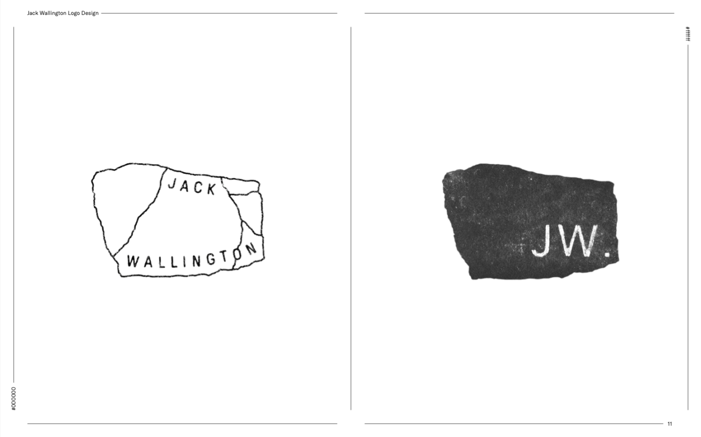
We’d talked about reducing the text down to just my initials ‘JW’ to remove my name as well as the term ‘garden design’ because in all honesty, I find it uncomfortable using my name in this way, and I’ve drifted away from the term ‘garden design’, feeling what I do is more about landscape and our place within it.
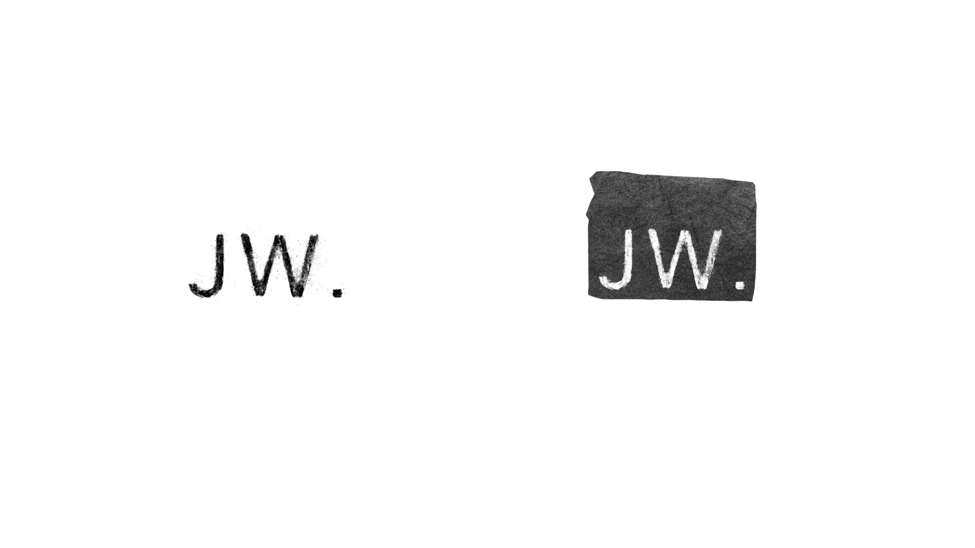
We liked the idea of a simple ‘JW’ studio and in Charlie’s first experiments with fonts, it started to look like an army dog tag formed of stone.
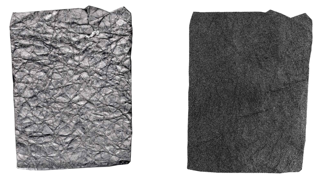
Then Charlie struck on something that guided the rest of the project, a rock with an interesting shape. He took the shape of that rock and superimposed the texture of the black graphite on paper to it.
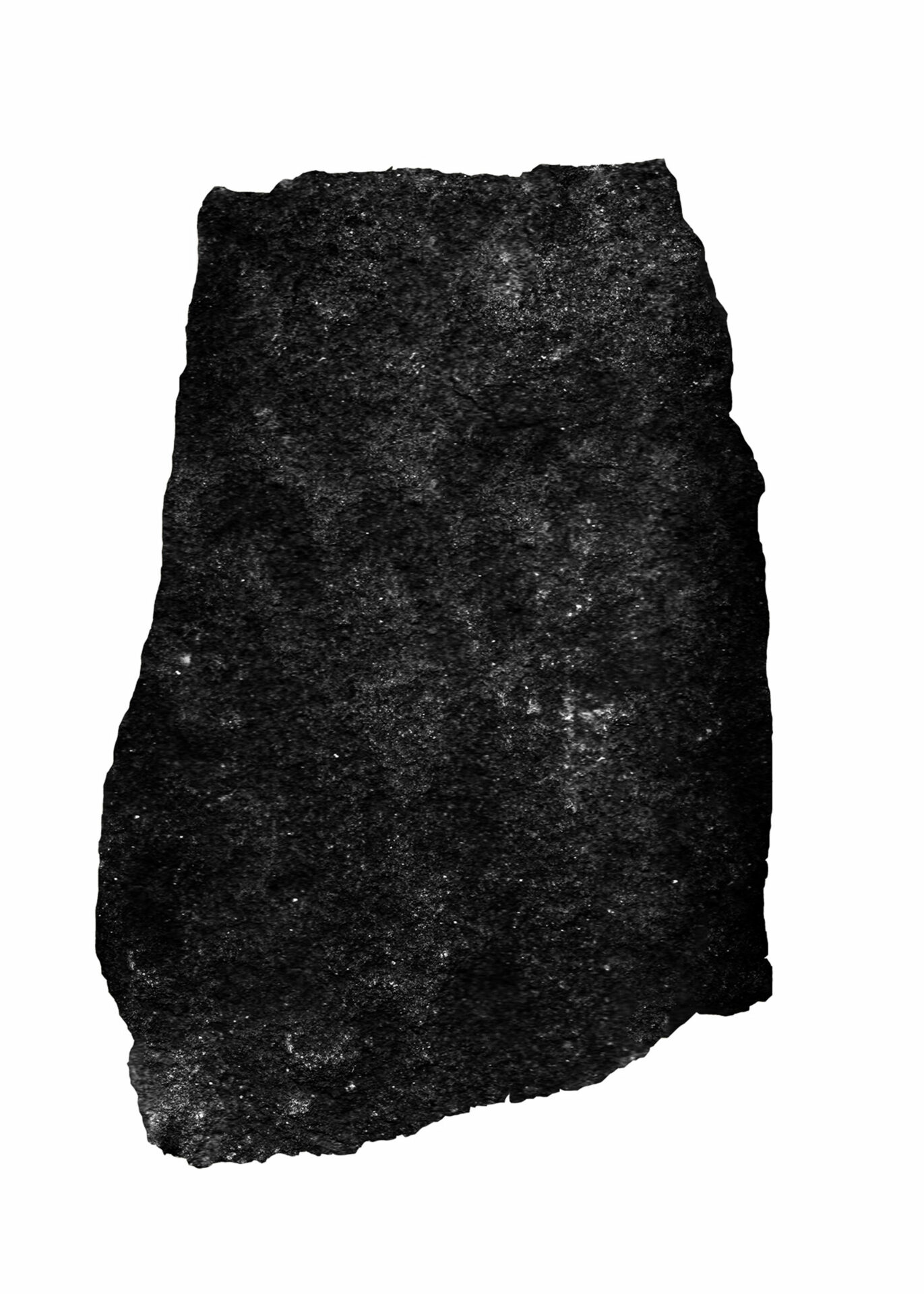
We both loved it. The unusual shape with the lettering etched onto it. When rotated vertically (if you tilt your head right!) it looks like a standing stone with ancient markings.
However, after some time and reflection we realised while this works for the design studio, it might not be clear enough for people who find my site from my writing or nature campaigning. There was no escaping it, Charlie worked to map my name back onto the stone shape. Though as Charlie pointed out, my name is the most awkwardly misbalanced name to try and put on a logo.

We loved the shape and didn’t want to lose it, so Charlie experimented with different ideas and we decided the original JW logo is perfect for smaller use, such as on mobile and social media. But how to get the desktop and bigger version right? Eventually, Charlie produced something that simply felt right…
I never imagined I’d end up having a logo created by an artist, let alone one I look up to so much. I feel incredibly grateful to Charlie for the generosity of sharing his work with me to help represent what I do. Thank you Charlie.
Visit Charlie Ford’s site and Instagram for his work and more about him.